.webp)

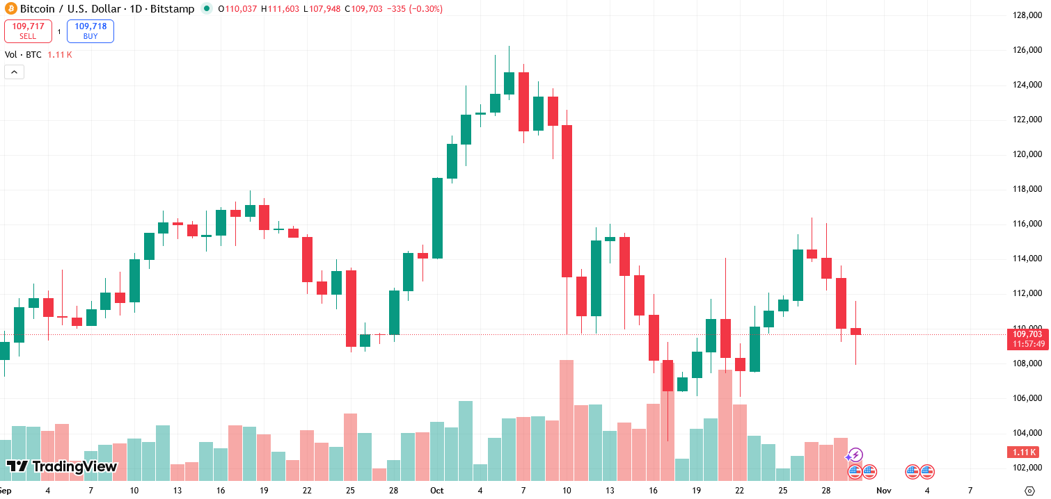
Crypto charts visualize how a coin’s price changed over time. They help you see trend direction, the size of swings, and where buyers or sellers took control. Crypto charts paint a picture of the current market, identify whether the sentiment is bullish or bearish, and help you make a decision on your trades.
Every price chart maps time on the horizontal axis and price on the vertical axis. Most platforms, such as TradingView, let you switch timeframes, compare assets, and add indicators such as moving averages or momentum tools. In crypto, the “daily” open and close are anchored to midnight UTC because trading never stops.
A line chart connects closing prices into a single curve. It’s great for a quick read on direction or for long trends where you want less noise. Many platforms also let you flip between linear and logarithmic scales, which changes how big moves look on the vertical axis.

On a linear scale, equal vertical distances show equal price units. On a log scale, equal vertical distances represent equal percentage changes. Log view tends to make multi-year crypto trends easier to compare, since a move from 10 to 20 is treated like 100 to 200 in percentage terms.
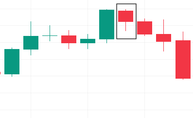
Candlestick charts get their name from the shape of each price bar: a solid “body” with a thin line sticking out like a wick. Bodies show up in red/pink or green. The body size, wick length, and color all reveal something about price action.
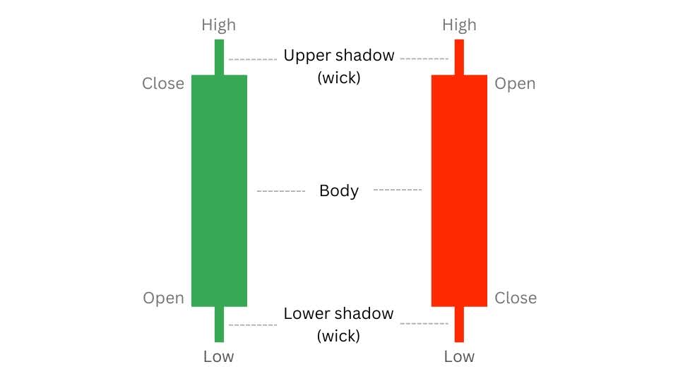
The body captures the gap between the opening and closing prices for the period you’re viewing. Green means price finished higher than it opened, so the open sits at the bottom of the body and the close at the top. Red (or pink) means the price finished lower, with the open at the top and the close at the bottom.
Be on the lookout for these crypto candlestick chart patterns and clues:
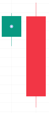
Doji: A doji has a tiny body with the open near the close. It signals hesitation. In a downtrend near support, a doji can be the first hint of stabilization. In a rally into resistance, it can warn that buyers are tiring.
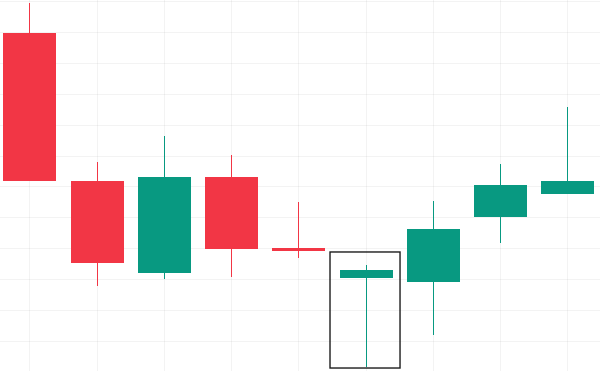
Hammer: The hammer, a bullish sign, has a small body with a long lower wick and usually appears after a downtrend, hinting at a possible reversal. It tells you sellers were active, but buyers stepped in and pushed the price back up.
Hanging man: The hanging man, a bearish sign, looks just like a hammer but shows up after an uptrend. In that spot, a close below the open can warn that momentum is fading.
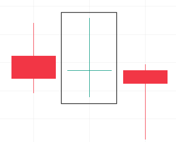
Engulfing patterns: There are two types of engulfing patterns - bullish and bearish. A bullish engulfing pattern is a small down candle followed by a larger up candle whose body covers the first.
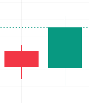
The bearish version flips that script. These patterns get stronger when they form at clean levels with supportive volume.

Bar charts, often called OHLC charts, mark four key points per period: open, high, low, and close. They carry more detail than a simple line without the visual “blocks” of candles.
Open-high-low-close data is the backbone of every bar and candlestick chart. A long body shows a strong push from one side. Long upper wicks show sellers hit back near the highs. Long lower wicks show buyers stepped in near the lows.
Even if you mostly read candles, it helps to know where data like spreads, recent trades, and depth of book can change price behavior around your levels. Advanced trading chart tools integrate these with chart overlays so you can watch candles and liquidity at the same time.

Support is a zone where buyers showed up before. Resistance is where sellers pushed back. You can draw them as horizontal levels taken from prior swing highs and lows, then watch how price behaves when it revisits those areas.
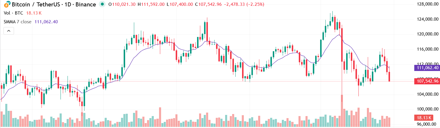
A simple moving average (SMA) smooths the price over a set number of periods. An exponential moving average (EMA) performs the same function but gives more weight to recent data, allowing it to react more quickly. Many traders watch whether the price is above or below a medium-length average to define a trend. Crossovers get a lot of attention, too. A short average moving above a long one is often called a golden cross, while the opposite is called a death cross. That being said, treat crossovers as context and not stand-alone signals.
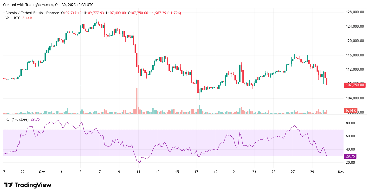
In the line chart below the candlestick price chart, the RSI oscillates between 0 and 100 and summarizes the balance of recent gains and losses. Traditional reference zones are above 70 and below 30. RSI above 70 usually flags an overbought asset, hinting the uptrend could be running out of steam. RSI below 30 usually flags an oversold asset, suggesting the downtrend may be losing momentum.
However, watch how RSI behaves around trend instead of thinking “overbought means sell” or “oversold means buy”. In strong uptrends RSI can stay elevated. In strong downtrends it can stay weak.
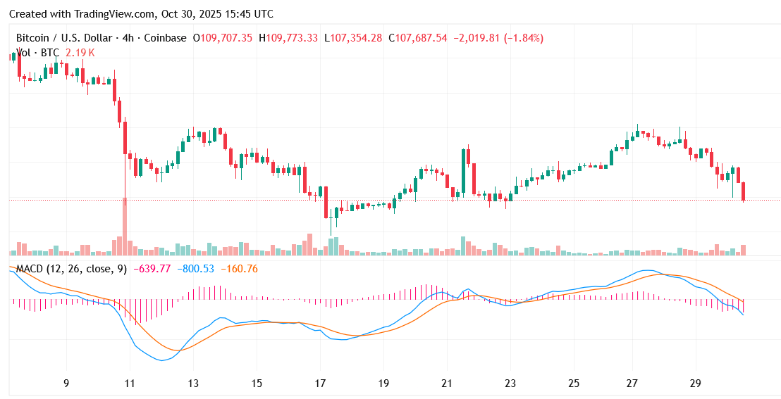
Moving Average Convergence Divergence (MACD) compares two EMAs and plots their difference along with a signal line. When the MACD drops below the signal line, that’s a bearish cue. When it climbs above, that’s a bullish one. Mind the gap between the two lines; the wider the distance, the stronger the signal.
Imagine Solana (SOL) has been making higher highs and higher lows on the daily chart. Price sits above the 50-day SMA, RSI stays in the upper half of its range, and MACD’s histogram is rising. You mark a nearby support zone taken from a prior swing high that price recently reclaimed. On a lower timeframe, you see a pullback into that zone with a small-bodied candle and a long lower wick, followed by a strong green candle on higher volume. That sequence gives you a simple story: trend up, pullback to support, buyers stepping in, momentum agreeing.
The tools did not predict the future; they helped you frame risk and timing. With the information at hand, you can then decide to trade your SOL over-the-counter or in spot markets.
With deep roots in traditional finance and the digital asset industry, Acquire.Fi operates as a specialist M&A advisory firm. Coverage spans M&A, secondaries, OTC, and capital markets advisory across digital assets and frontier tech. Decades of combined experience across every stage of the deal lifecycle.


.webp)